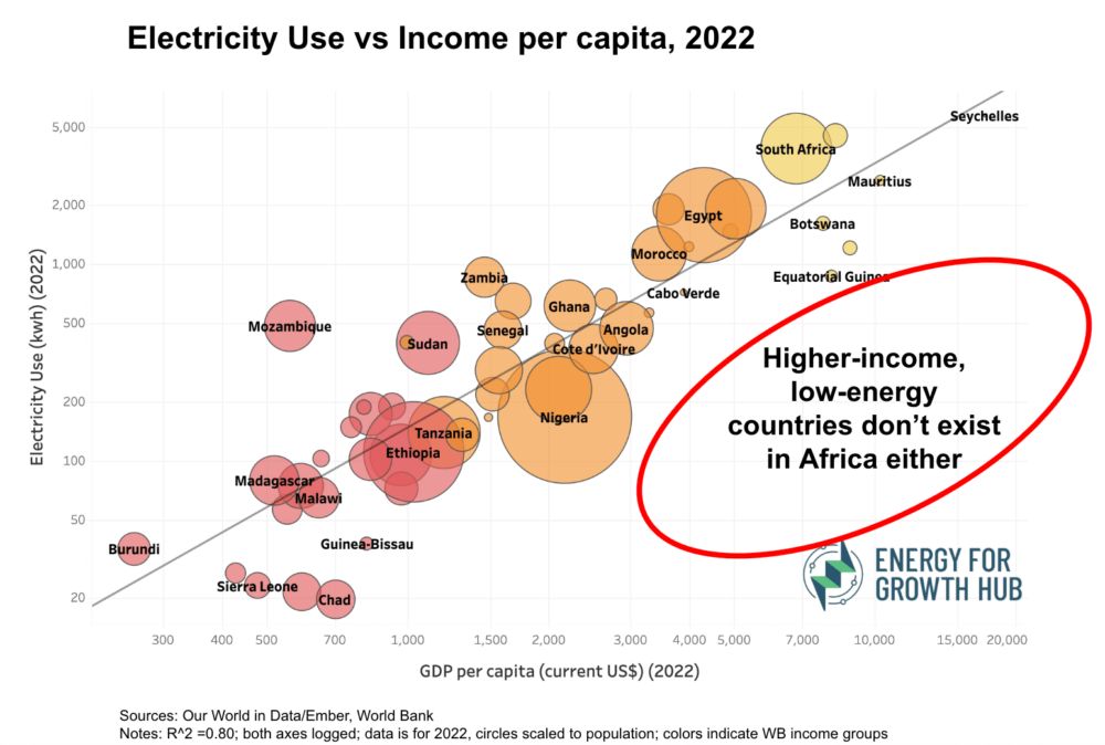
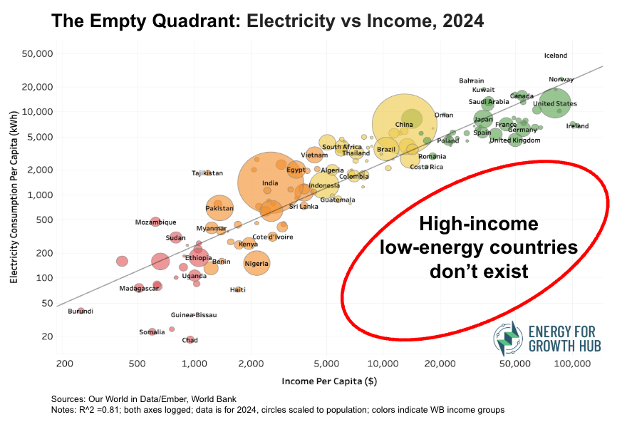
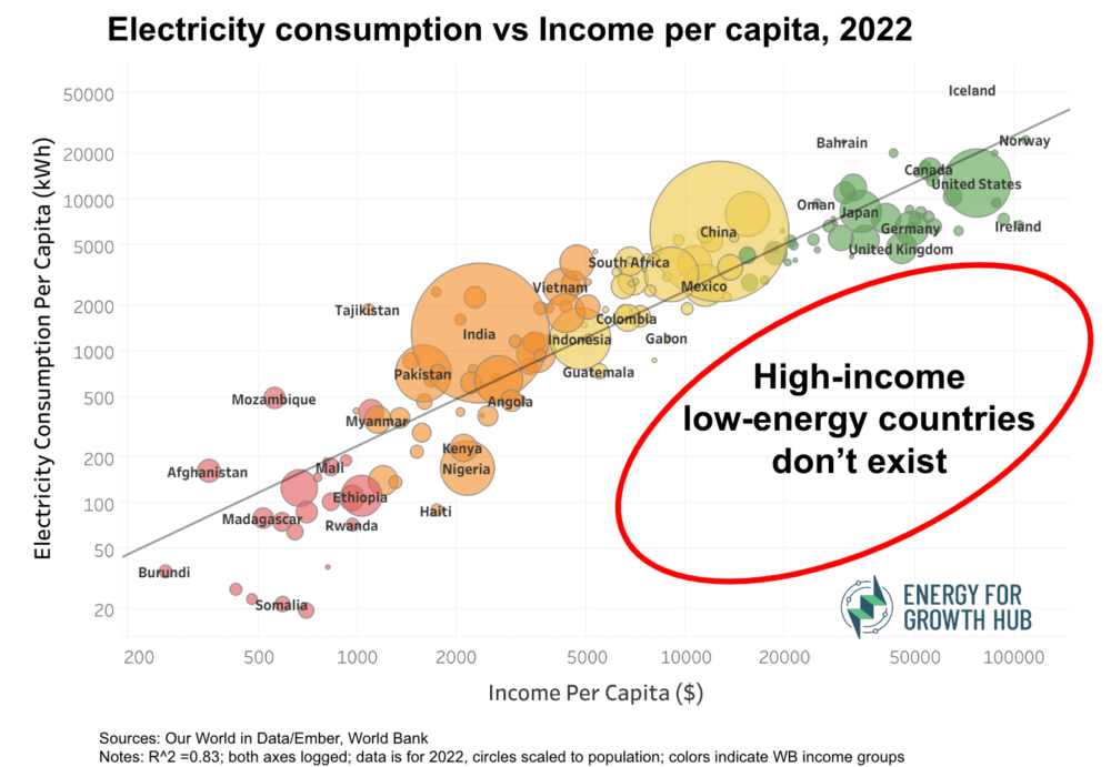
The Hub has renamed its ‘high-income low-energy’ viral graphic The Empty Quadrant, which focuses on the large empty space on the lower right section of the graphic (i.e., there are no high-income, low-energy countries).
The Empty Quadrant shows that poor countries cannot get rich without a lot more electricity.
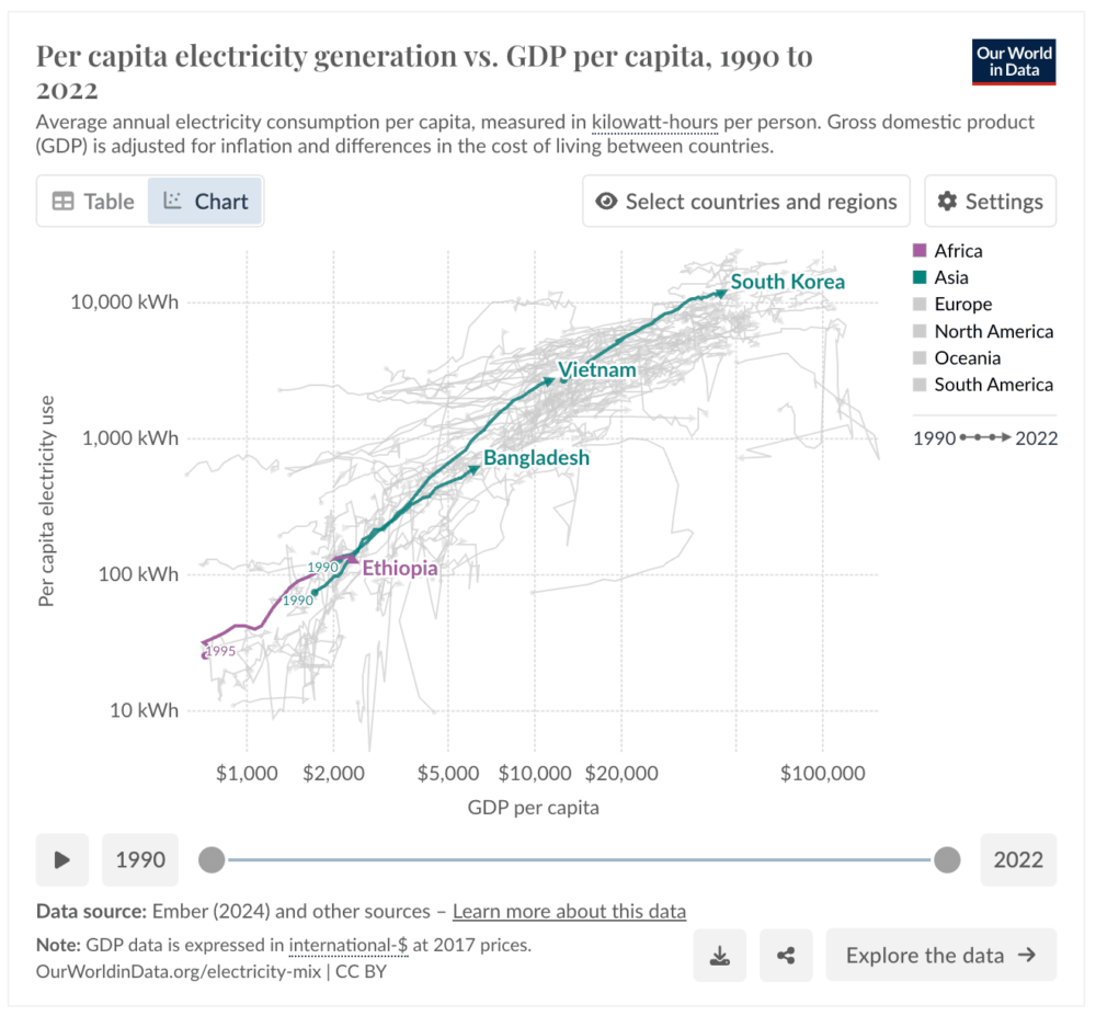
Energy and growth go together. Countries that aspire to move into middle-income and then high-income status need to generate — and consume — more energy.
There are NO EXCEPTIONS. While a few countries like Costa Rica and Romania sneak into the high-income group with kWh/capita below 3,000, all countries above $30,000 use at least 4,000 kWh.
We are not claiming direct causality. Yet one cannot be done without the other. Higher income drives greater energy demand, and energy use can drive greater incomes, especially when used outside the home. This relationship can be a virtuous cycle or a poverty trap, but cannot be evaded.
The Empty Quadrant is a stark illustration of inequality.
People in high-income countries don’t just use a bit more electricity than people living in low-income countries, they use 67 times more.
A few notes on the data:
We used Our World in Data’s per capita electricity demand dataset, which takes per capita electricity generation that is commonly used (including by us) and improves the estimates by adjusting for net imports. For income we used World Bank GDP per capita.
Most countries align with the trend line (R^2 is 0.81). Those above the line are consuming more electricity than their income level would predict, while the opposite is true for those below the line.
A few farthest from the trend line include:
Several extremely low-income countries (Sierra Leone, Chad, Burundi, and Somalia) are at the very bottom of both electricity use and income.
Tajikistan and Mozambique, both relatively poor countries, are above the line. Both rely largely on legacy large-scale hydropower generation to run energy-intensive industries for export, particularly aluminum.
At the other energy and income extreme, Iceland is also way above the line because the tiny nation produced 48,424 kWh per capita in 2024. Most of that power is used for smelting aluminum and, increasingly, data centers, which are in practice other forms of exporting energy that are not captured in the electricity trade data.