


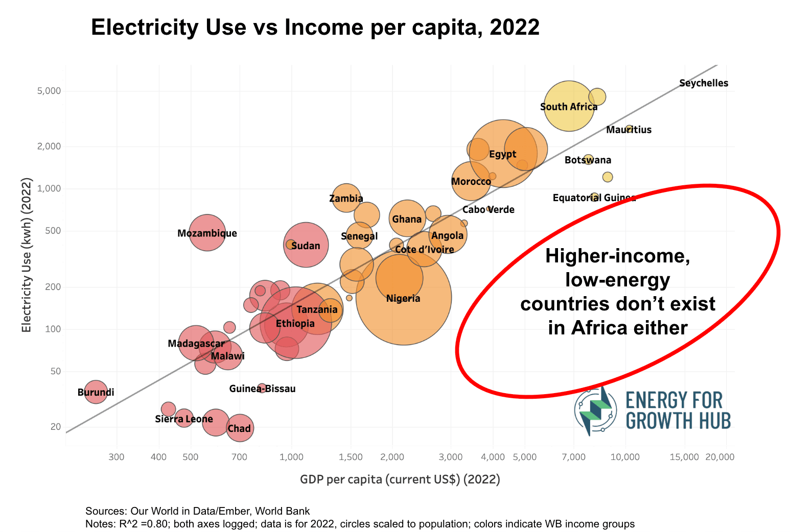
Last fall, we updated our viral scatterplot of income and electricity use showing why high-income low-energy countries don’t exist. Some people asked if that’s also true for Africa. Great question! So we created an Africa-only version, using data from our friends at Our World in Data.* And no, higher-income, low-energy countries don’t exist in Africa either.
Just like the rest of the world, as African countries climb the development ladder, income and electricity consumption rise together.
A few thoughts:
- The correlation is tight. The Africa-only trendline has an R² of 0.80, about the same as the global version’s 0.83.
- This scatterplot has no real outliers. Mozambique maybe. It uses more power than expected for its income due to its energy-intensive aluminum exports powered by domestic hydropower. On the flip side, Equatorial Guinea should be using a lot more power given its higher income, but of course its an oil economy where almost all the spoils are captured by a tiny elite.
- Almost all African countries are well below the global average of 3,664 kWh and 80% are below the 1,000 kWh Modern Energy Minimum.
While our original graphic is an illustration of global energy inequality, this one shows inequality is also stark within Africa. People in upper middle-income countries don’t just use a bit more electricity than people living in low-income countries, they use nearly 20 times more (UMIC average is 2,344 kWh vs LIC average of 121 kWh).).
Most of all, the graphic shows that African countries will need a lot more energy to grow richer. As the world (rightly) commits to connecting all people to modern electricity, the economies where they work will need abundant reliable power too. No energy-scarce shortcuts to progress.
You can dig deeper into the data with this interactive version.
We love suggestions like this, so keep them coming.