
I first realized how powerful satellite data could be more than a decade ago. I started my career as an analytics consultant at a major firm in the wake of the Great Recession. Part of my job was looking for ways data and analytics could open up new markets.
Hedge funds caught our attention. They were buying millions of high-resolution satellite images of department stores and using algorithms to count cars in their parking lots. The counts revealed a retailer’s quarterly sales weeks before official reports came out, giving the funds an edge nobody else had. The first firms to exploit these strategies minted fortunes.
I thought it was clever, but the contrast was hard to ignore: as a society, we were investing in elaborate satellite-based systems to fine-tune stock market allocations while billions of people remained unmapped and underserved. Why wasn’t anyone using these technologies to plan basic infrastructure or to check whether poverty reduction programs actually worked?
Researchers have since taken on some of these applications with mixed success, and I left consulting to join them. Along the way, I learned firsthand why remote sensing hasn’t worked the same way in emerging economies and why it is finally starting to.
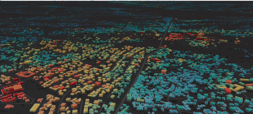
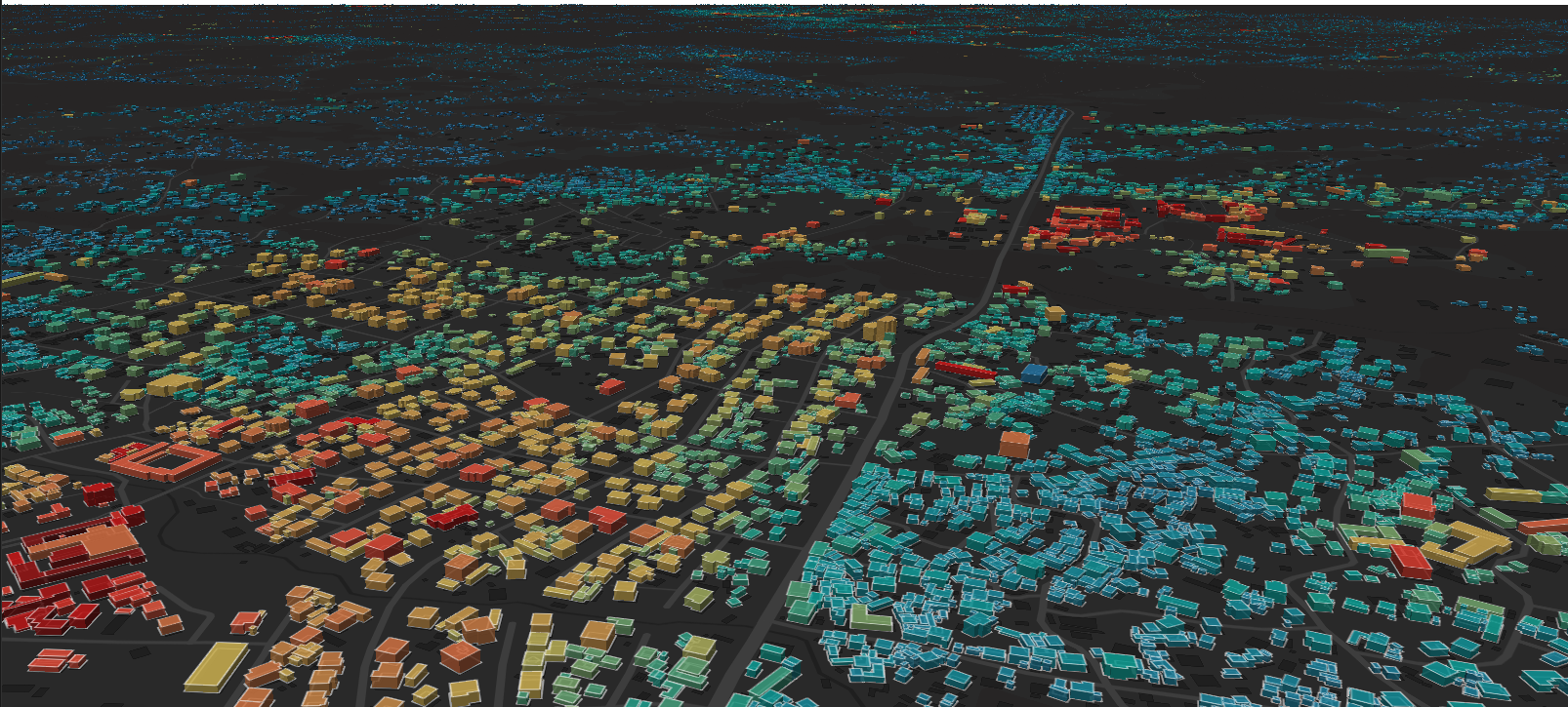
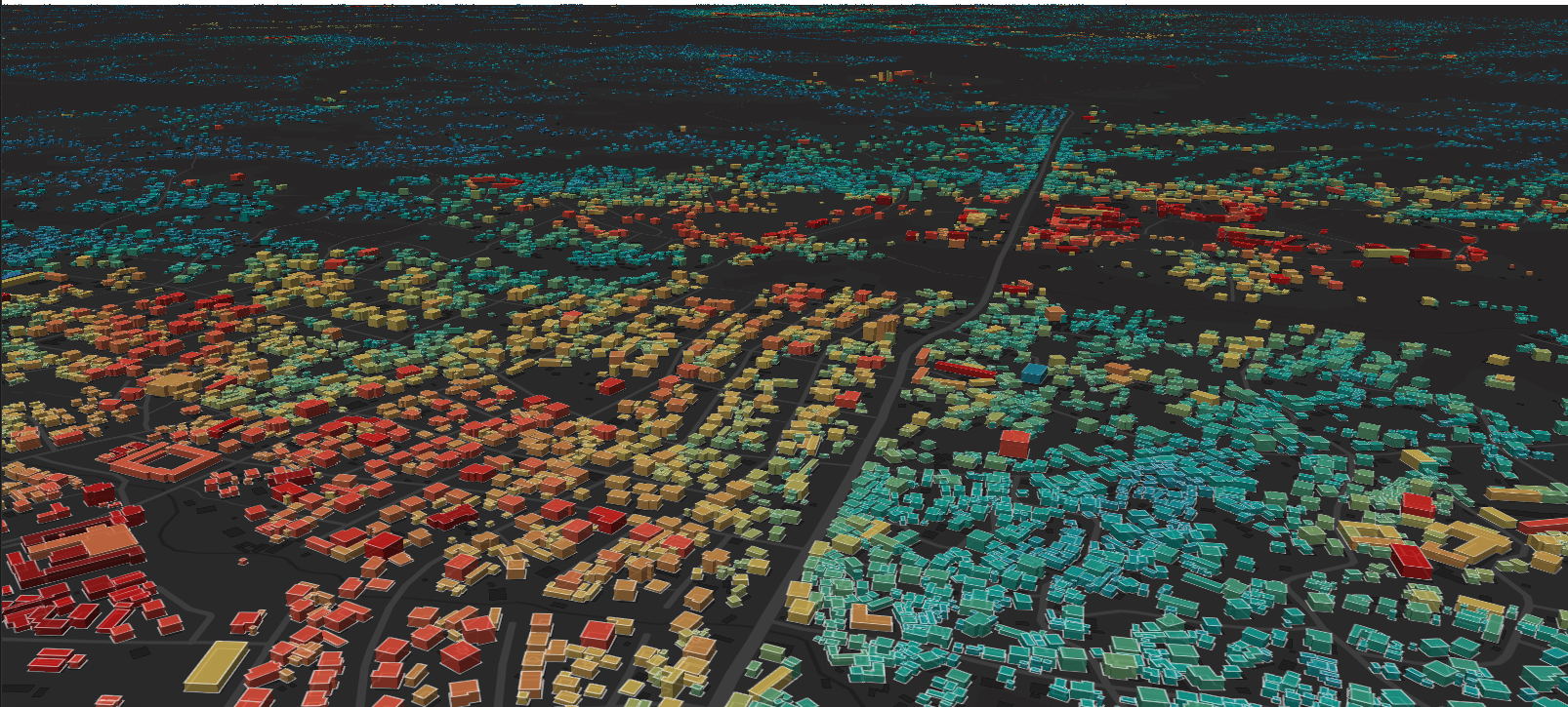
That change is exemplified by a system my colleagues and I developed, which combines satellite imagery with utility and survey records to estimate electricity use and income for every building in entire countries. For the first time, we have granular data that can help us diagnose needs and track project impacts, creating a positive feedback loop where each intervention can inform the next.
I believe these capabilities will fundamentally change what we can measure, and therefore how we direct resources to end global poverty.
Without Granular Data, Planners Are Flying Blind
Most “data-driven” decisions in global development rest on numbers that describe an entire country or region: a national statistic, an average access rate, or a survey of a few thousand households extrapolated to whole populations. Billion-dollar programs get designed on top of evidence that is far coarser than the decisions it informs.
Imagine a schoolteacher who wants every student to succeed but only sees the class average, without ever seeing a single student’s test. The teacher can see that students are struggling, but not where or why, so every fix is a guess.
Development planners are in that position today, and the same resolution gap shows up across sectors:
- Energy: Electric grids get overbuilt in some places and underbuilt in others, with compounding inefficiency on both sides [1, 2, 3].A
- Consumer Finance: Banks struggle to find the customers who would benefit most from credit [4, 5, 6].B
- Public Health: Health programs often conclude before anyone knows whether they worked [7, 8].C
The result is trillions of dollars allocated based on overstretched numbers no one can independently check.
In principle, remote sensing data should offer a solution since it covers every place on Earth. But raw coverage is not the same as specific insight. Estimating how much electricity a neighborhood uses, or how much households within it earn, still requires local data to calibrate against, and that local data is exactly what’s been missing.
Emerging Markets’ Data Is Too Messy for Standard AI; Our Models Treat It Like a Crossword Puzzle
I spent several years developing machine learning models to estimate building-level electricity use in East Africa. Electricity demand is the single most consequential input in electrification planning, yet no one had ever provided it at high resolution and at scale.
To teach a model what electricity use looks like from space, my colleagues and I needed to link two datasets: (1) remote sensing data describing buildings and (2) utilities’ customer billing records showing where customers are and how much electricity they use. But when we obtained the records, we hit a wall. The customer locations were mapped so imprecisely that we couldn’t tell which meters corresponded to which buildings.
This problem is common across emerging markets, where location data is distorted by low-quality GPS units, inexperienced data collectors, and immature address systems. Pure data-hungry machine learning falls apart with inputs this messy.
So we developed new model architectures to address this problem.
We built a probabilistic translation layer between the imprecise utility data and the satellite view of buildings. The layer works the way a person might solve a crossword puzzle: first shortlisting candidate words from the clues, then weighing how well each fits with everything else in the grid. Our models solve millions of these puzzles, gradually working out which meters belong to which buildings while learning what a building’s appearance reveals about its electricity use [9, 10, 11].D
We have since built early models for building-level income and growth.
Encouraging Results: From Statistical Validation to a World Bank Pilot
We’ve been applying this approach through a platform called Open Energy Maps, launched in 2024. We started in Africa and are now extending into Asia, the Middle East, and Latin America [12].
We validate our estimates against real utility data and integrate them into the national electrification planning models used by governments. Two results stand out so far:
- Our model reveals the type and size of infrastructure that communities actually need. When estimating how much electricity a settlement uses, our numbers show 15-46% less error than those used by leading planning models.E
- Our estimates can drive costs down. In our most conservative analyses, we see 7% lower total electrification investment costs than status-quo methods. Scaled across emerging markets, that points to hundreds of billions of dollars in potential savings over the coming decade.
Our work is already being used by influential development organizations. The World Bank and utilities are piloting our models to improve national electrification plans. The International Energy Agency has featured this work in its commentaries, and Sustainable Energy for All offers our outputs to planners and investors through its open data tools [13, 14].
The Transparency Dividend: Verification Builds Trust, Improves Estimates, and Directs Spending
Building-level estimates are not just more accurate: they are auditable.
Every number ties back to a real place that can be independently verified. Utilities can cross-check our consumption estimates against their metered data, statistics bureaus can validate our income estimates against their surveys, and funders can measure whether a specific intervention moved outcomes at the building and neighborhood levels.
Aggregate statistics have none of these properties: errors get buried in averages, and numbers that are hard to challenge persist far longer than they should.
We call this dynamic the Transparency Dividend. Verifiable outputs build institutional trust, and each verification generates new labeled data that can feed back into the models, improving accuracy over time. As trust and accuracy grow, capital can flow toward interventions that demonstrably work.
Together, these properties make continuous planning feasible, and programs can be corrected as they go instead of after the fact [15].
An enormous wave of new capital is coming as AI wealth turns to philanthropy. What remains scarce, as Stripe’s Nan Ransohoff argued in a recent essay, are the institutions, talent, and ideas to deploy it well.
This work is one such idea. Energy has given us the proof of concept; new philanthropic capital would let us extend it further to income and poverty, and build the monitoring infrastructure to turn these estimates into steady, measurable gains. The most leveraged bet in development is the one that verifies all the others.
Notes
A. In optimization models applied to a service territory in Uganda, failure to model demand heterogeneity prescribes grid extension for 12 percentage points more consumers than the cost-optimal plan requires, and unit cost-of-service estimates span a nearly threefold range depending on the demand assumptions used [3].
B. The credit gap for micro, small, and medium enterprises (MSMEs) in emerging markets runs to $5.7 trillion, the difference between potential demand and the credit currently supplied [4, 5]. Roughly three billion people worldwide lack adequate credit history to access formal financing [5].
C. In 2006, the Center for Global Development’s Evaluation Gap Working Group found that, despite decades of development spending, little was known about the net impact of such social programs. Of 127 studies of community health financing programs reviewed, only two were able to derive robust conclusions about impact on health service access [7].
D. Remote sensing inputs include satellite imagery, building footprints and heights, nighttime lights, weather data, and internet connectivity speeds, among others.
E. The 15-46% error reduction figures are based on internal analyses of our settlement-level demand estimates. To arrive at these figures, we compared our results against a 2025 extract of the World Bank’s Global Electrification Platform in Rwanda, stratifying the validation data by cluster size and building count.
References
- S. J. Lee and J. Taneja. Why energy demand demands more attention. Energy for Growth Hub, 2020.
- S. J. Lee and J. Taneja. Long-tailed distributions and electrification planning: Why we need to model the “long tail” of large consumers. Energy for Growth Hub, 2022.
- S. J. Lee, E. Sánchez, A. González-García, P. Ciller, P. Duenas, J. Taneja, F. de Cuadra García, J. Lumbreras, H. Daly, R. Stoner, and I. J. Pérez-Arriaga. Investigating the necessity of demand characterization and stimulation for geospatial electrification planning in developing countries. Technical Report CEEPR Working Paper 2019-018, MIT Center for Energy and Environmental Policy Research, 2019.
- International Finance Corporation. MSME Finance Gap: Assessment of the Shortfalls and Opportunities in Financing Micro, Small, and Medium Enterprises in Emerging Markets. Technical report, International Finance Corporation, 2017.
- International Finance Corporation. Cracking the Credit Code: Alternative Data and AI for Financial Inclusion. Technical report, International Finance Corporation, 2026.
- L. Klapper, D. Singer, L. Starita, and A. Norris. The Global Findex Database 2025: Connectivity and Financial Inclusion in the Digital Economy. World Bank, Washington, DC, 2025. doi: 10.1596/978-1-4648-2204-9.
- W. D. Savedoff, R. Levine, and N. Birdsall. When Will We Ever Learn? Improving Lives through Impact Evaluation. Technical report, Center for Global Development, 2006.
- C. G. Victora, R. E. Black, J. T. Boerma, and J. Bryce. Measuring impact in the Millennium Development Goal era and beyond: a new approach to large-scale effectiveness evaluations. The Lancet, 377(9759):85–95, 2011. doi: 10.1016/S0140-6736(10)60810-0.
- S. J. Lee. Multimodal Data Fusion for Estimating Electricity Access and Demand. PhD thesis, Massachusetts Institute of Technology, 2023.
- S. J. Lee and C. Drouin. Forecasting residential heating and electricity demand with scalable, high-resolution, open-source models. Energy and AI, Vol. 24, May 2026, art. 100726. doi: 10.1016/j.egyai.2026.100726.
- C. L. Dean, S. J. Lee, J. Pacheco, and J. W. Fisher, III. Lightweight data fusion with conjugate mappings. arXiv preprint arXiv:2011.10607, 2020.
- S. J. Lee and J. Taneja. Tracking Multi-Tier Framework Progress at the National Level with Open Energy Maps. Working paper, 2025. doi: 10.13140/RG.2.2.28249.99689.
- D. Edeme, M. Kueppers, S. J. Lee, and D. Wetzel. Africa’s electricity access planners turn to geospatial mapping. IEA Commentary, International Energy Agency, March 2024.
- Sustainable Energy for All. Sustainable energy for all and IBM launch new AI solutions for energy and urban development. SEforALL Press Release, November 2024.
- S. J. Lee. Adaptive Electricity Access Planning. Master’s thesis, Massachusetts Institute of Technology, 2018.