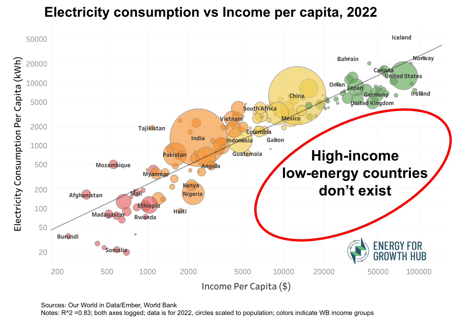
One of our most viral graphics makes a simple but powerful point: high-income, low-energy countries don’t exist. That’s because as countries become richer, they need more energy. If they don’t get more, they will stay poor. Although causality goes in both directions, the bond between energy use and economic growth is undeniable.

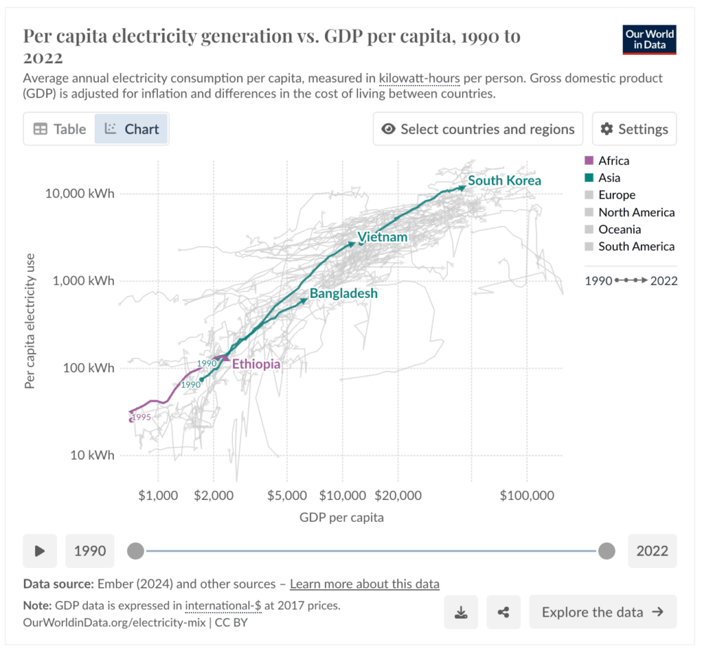
But many asked: What does this look like over time? Which countries are moving up the energy ladder, and which are stuck or sliding down? Great question! So, using Our World in Data visuals, we’ve selected a sample of countries to show their progress (or not) since 1990.
Here are 3 animated images. Press ▶️ to watch trends 1990-2022.
The Climbers
Some countries are steadily rising in both per capita electricity generation and GDP. Watch Vietnam, Korea, Bangladesh, and Ethiopia.
The Strugglers
Others have experienced zigzagging or even sharp declines in both electricity generation and economic output. Watch Lebanon, Nigeria, Burundi, El Salvador, and Haiti.
The mega trends by income groups
Watching countries climb in groups according to World Bank income classifications is revealing.
- Middle-income countries are rocketing up the ladder. LMICs more than doubled both electricity generation and GDP, while UMICs more than tripled each.
- Low-income countries had only minimal improvements in GDP while electricity per capita actually declined.
- High-income countries, as might be expected, have seen electricity generation start to plateau even as GDP continues to grow.
These trends all make intuitive sense too. The energy ladder shows that those who climb are those who generate long and prosper.


