

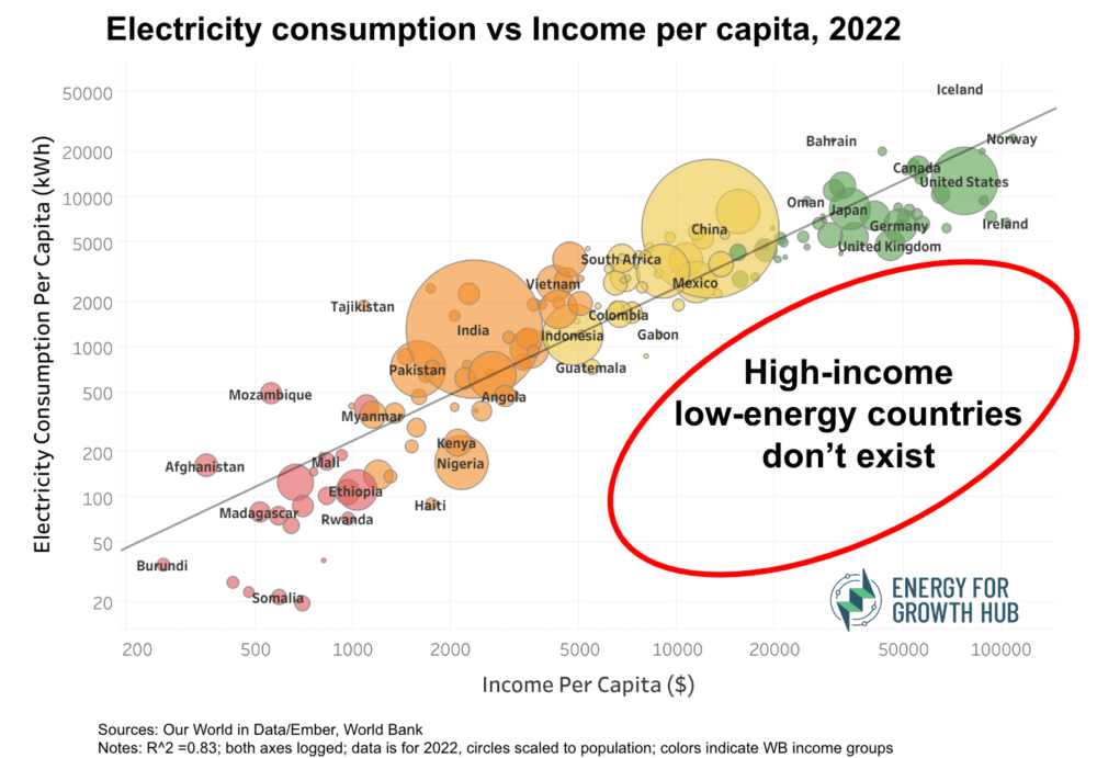
One of our most viral graphics (after Todd’s fridge) has been a scatterplot showing per capita electricity and income. We’ve updated the image here using the latest available data from Ember (h/t to the good folks at Our World in Data).
The link between energy and economic growth is undeniable: throughout history and across all regions, higher income levels consistently align with greater energy consumption. Although different economies have different energy intensities, this scatterplot has no real outliers. And the lower right quadrant is empty.

→ Share this on Twitter/X and LinkedIn.
Dig deeper into the data with this interactive version.
Notes on the data:
- We used Our World in Data’s brand new (!) per capita electricity demand dataset, which takes per capita electricity generation that is commonly used (including by us) and improves the estimates by adjusting for net imports. We believe this is a better consumption estimate because we care more about how much electricity people use than the location of where it’s generated.
- Most countries align with the trendline (R^2 is 0.83). Those above the line are consuming more electricity than their income level would predict, while the opposite is true for those below the line.
- A few farthest from the trendline include:
- Several extremely low-income countries (Somalia, Chad, Sierra Leone, and Central African Republic) are at the very bottom of both electricity use and income.
- Tajikistan and Mozambique, both relatively poor countries, are above the line. Both rely largely on hydropower generation to run energy-intensive industries for export, particularly aluminum.
- At the other energy and income extreme, Iceland is also way above the line because the tiny nation produced 53,285 kWh per capita in 2022. Most of that power is used for smelting aluminum (and, increasingly, data centers) which are in practice other forms of exporting energy that are not captured in the electricity trade data.
The graphic is also a stark illustration of energy inequality. People in high-income countries don’t just use a bit more electricity than people living in low-income countries, they use 77 times more.