Bottom Line Impact
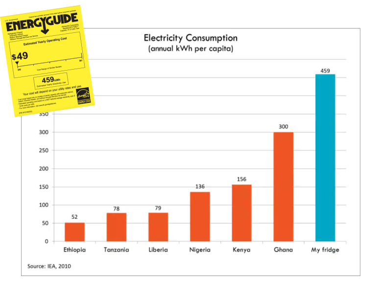
Per capita energy consumption is one of the most jarring illustrations of global inequality. In 2013, Todd Moss created a simple bar chart comparing his fridge’s power use to per capita consumption in six African countries. The graphic struck a nerve and has been circulating in major media outlets and campaigns ever since.
Why It Matters
Why does The Fridge graphic continue to resonate? The crisp infographic drives home a striking — and deeply relatable — point, and makes the scale of energy inequality immediately clear. The Fridge illuminates the indefensible gap between energy haves and have-nots, and screams for immediate solutions. Journalists, advocates, and policymakers continue to use it as a tool in the fight to make energy abundance a reality for everyone. Using data to change paradigms and drive action is the Hub’s sweet spot, and the Fridge is our original example.
What We Did
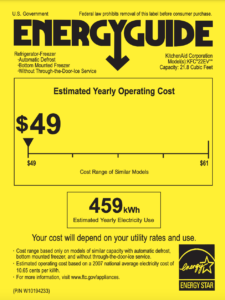
Bought a refrigerator. When Todd Moss shopped for a refrigerator with his family outside Washington, DC, back in 2013, the yellow efficiency tag reported that the appliance would use 459 kWh per year. Todd realized that was more electricity than most people in African countries use in a whole year.
Big Win: Todd’s fridge lives on in the media, campaign messages, and philanthropy.
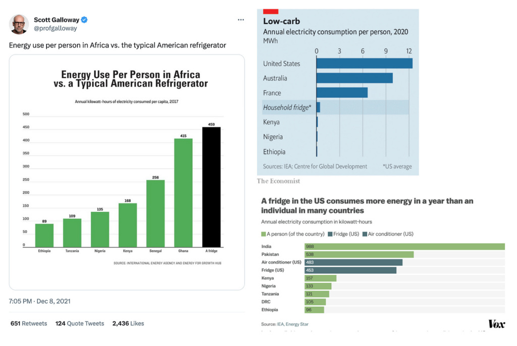
The Fridge has been reposted by Ezra Klein in the Washington Post, Brad Plumer in Vox, by USA Today, and Bill Gates on X. It’s been recreated by the Economist, Vox, Foreign Policy, and Forbes, and cited in recent articles in Le Monde and Vox. Swedish environmental activist Greta Thunberg even invoked The Fridge in the Guardian.
Key Partners
- JennAir JFFCC72EHL, 2013 Top-selling Refrigerator.
Learn more about how the Fridge data led to the creation of the Energy for Growth Hub.